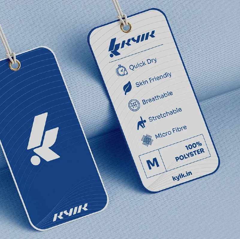
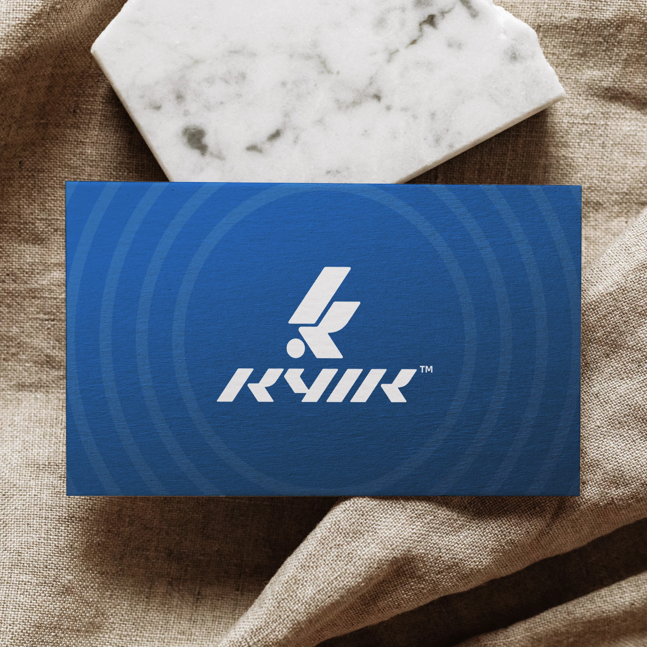
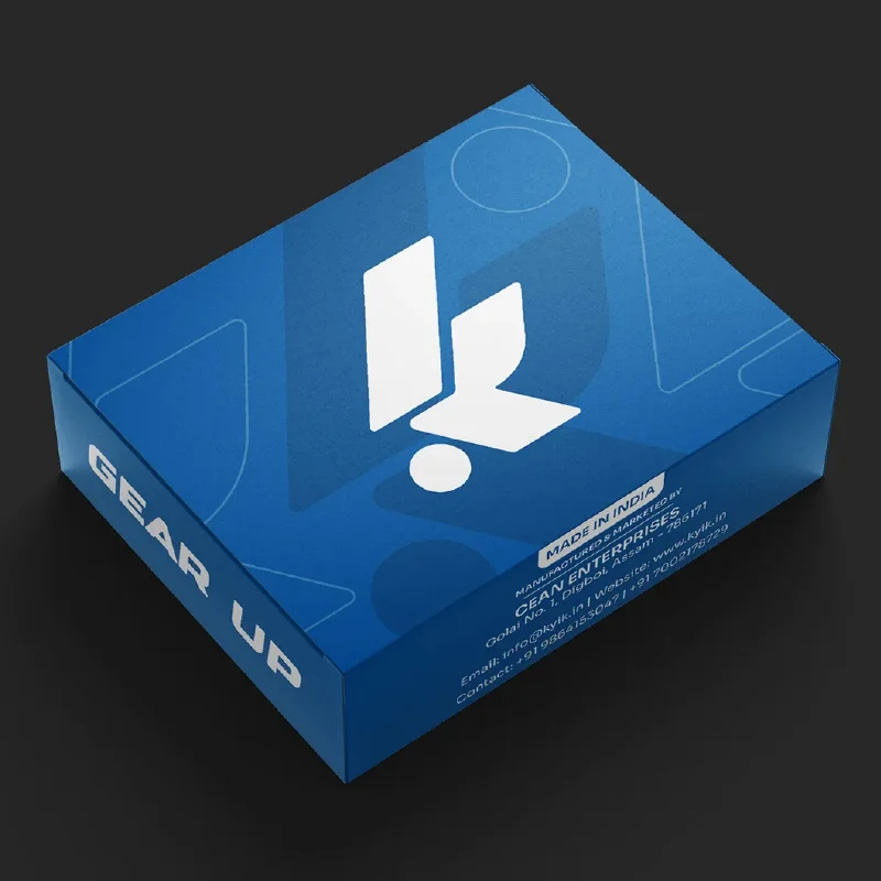
It started with the logo, a custom wordmark designed to feel like movement in still form. Every angle and cut suggests speed and control. The wide stance gives it strength while the slanted strokes drive it forward. Everything around it—color palette, layout, typography—was chosen to amplify that energy. The brand system is designed to flex across product, digital, and physical environments, always delivering the same message: KYIK is built to move.